Your Own Special Cocktail: When it comes to concrete and color
BY LENA WECKSTRÖM
13.02.2019
Concrete is a wonderful material because it can be transformed into any shape or color, is truly resistant to weather and wear and, at its best, can be extremely beautiful. When designing your graphic concrete pattern or image, you need to think about the concrete color as a basic determinant of how your image is going to look. When it comes to color and concrete, you have three components to play with:
Aggregates: The basic material making up the concrete, ranging from fine (like sand) to coarse (like crushed stone); aggregates come in many natural colors.
Cement: The powdery substance that reacts with water, binding the aggregates together when it hardens; cement comes in gray or white.
Pigments: Color added to the concrete mix, coloring the cement (the aggregates will not catch any color). An endless variety of pigments is available.
It’s tempting to think that you could mix and match these components endlessly to bring about the exact color that you want, or even find the most intriguing of color combinations.Stop!With color and concrete, it’s important to remember two things:Keep it simple.
If you want a specific and precise CMYK color, forget concrete.
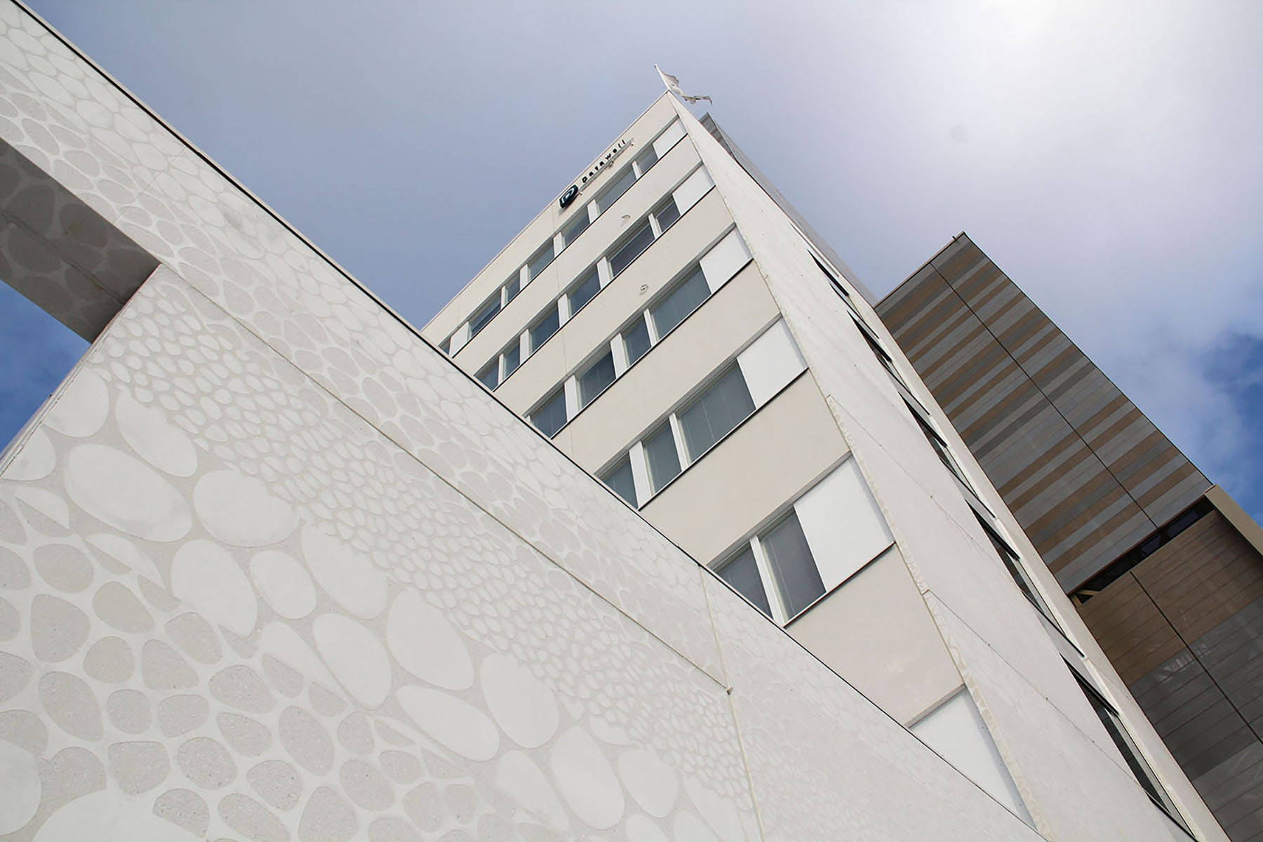
Uniformity of color is essential for a high-quality concrete finish, and you will probably succeed as long as you remember that first rule, to keep it simple. As for precision, the final color depends not only on the mix ingredients, but also on the proportions you use, on the form material, the placing and curing techniques, the casting temperature, and more.When choosing cement and aggregate colors, what you actually look for is the level of contrast between the exposed aggregate surface and the smooth cement surface. That’s because the contrast is what will determine how visible your graphic concrete image will be.For example, if you were to use white aggregate and white cement, there would be very little contrast. This results in an elegant and subtle look, hardly noticeable from great distances.
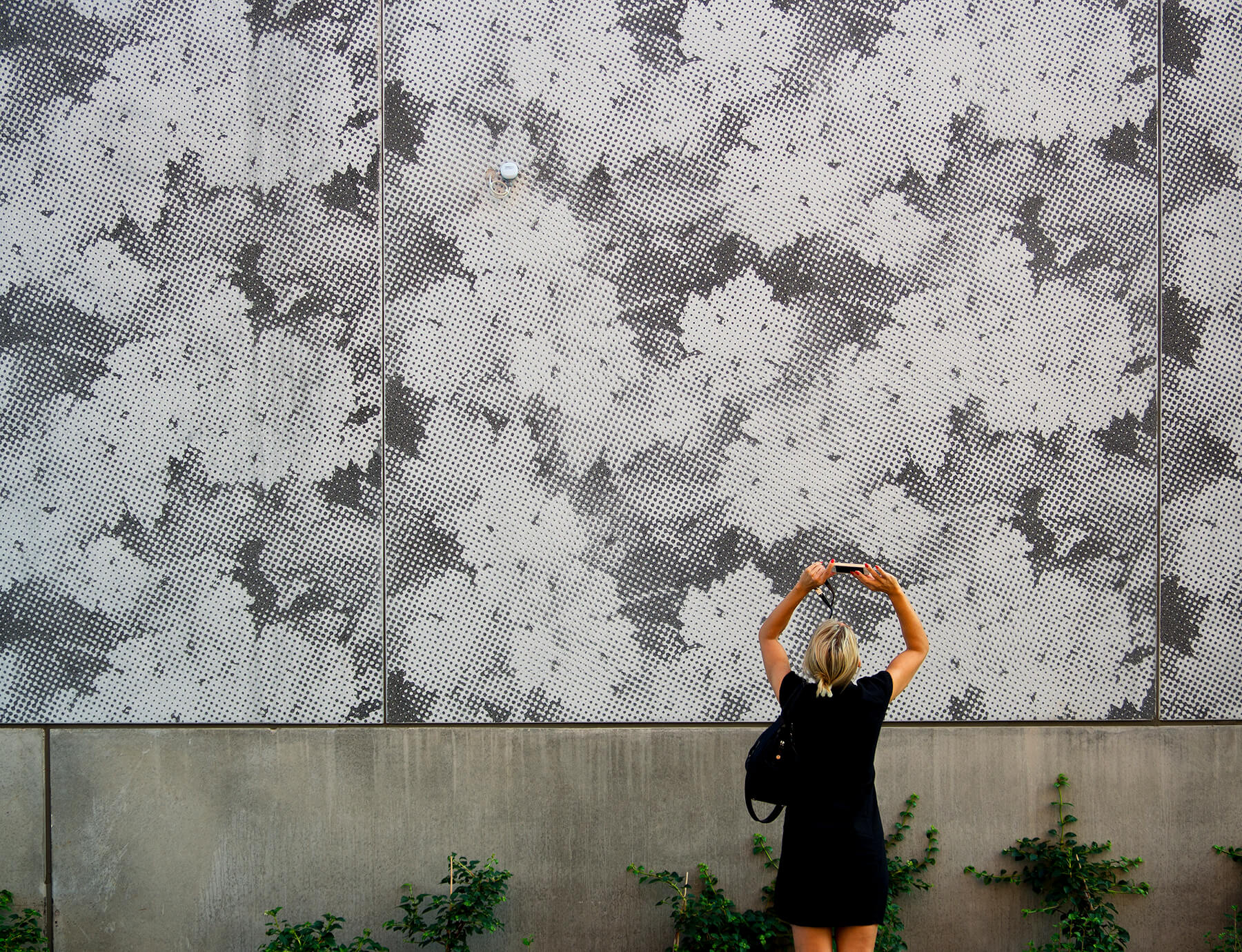
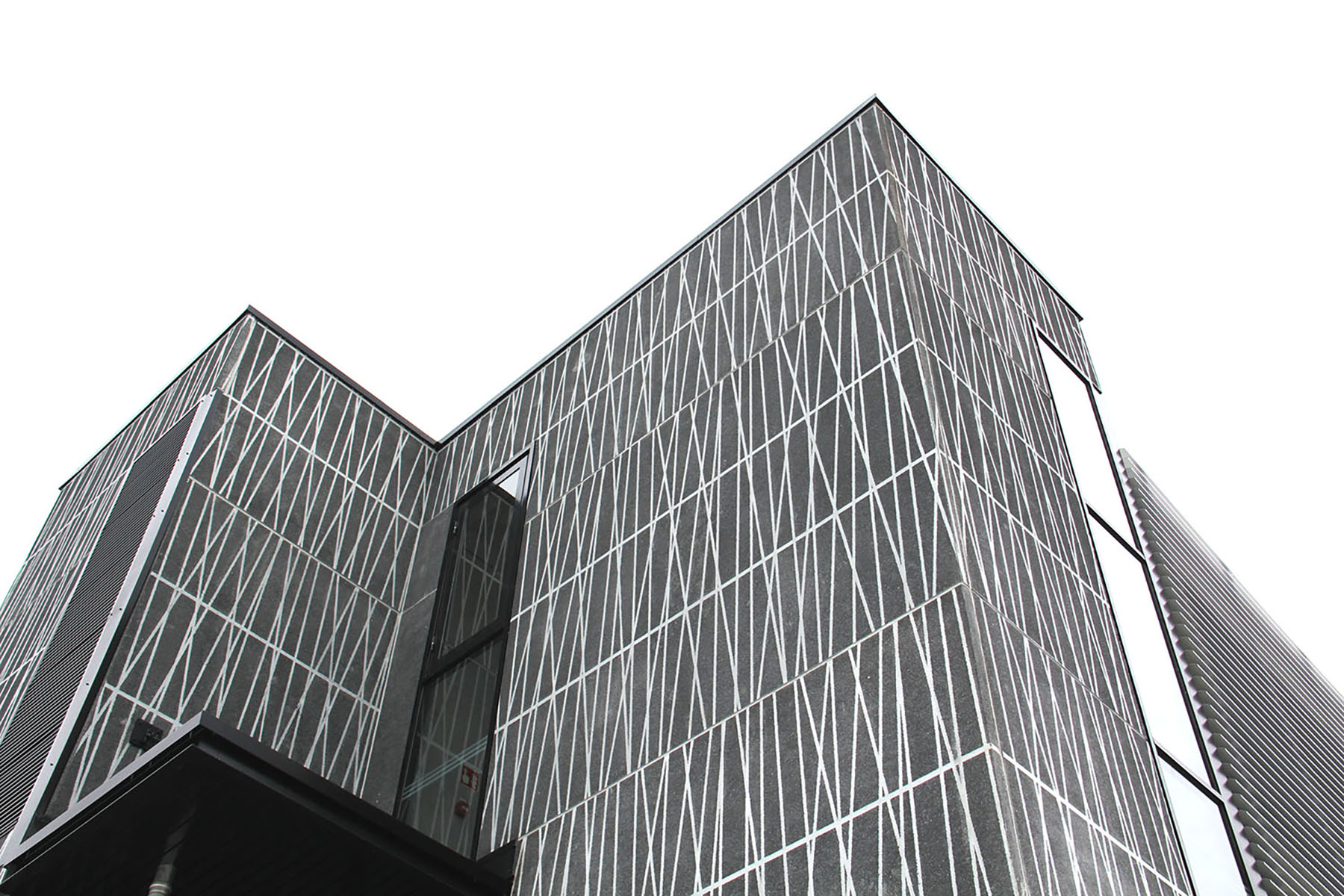
At the other extreme, black aggregate and white cement will yield maximum contrast.
This works well for strong impressions and photo-imaging. It is very noticeable at any distance.
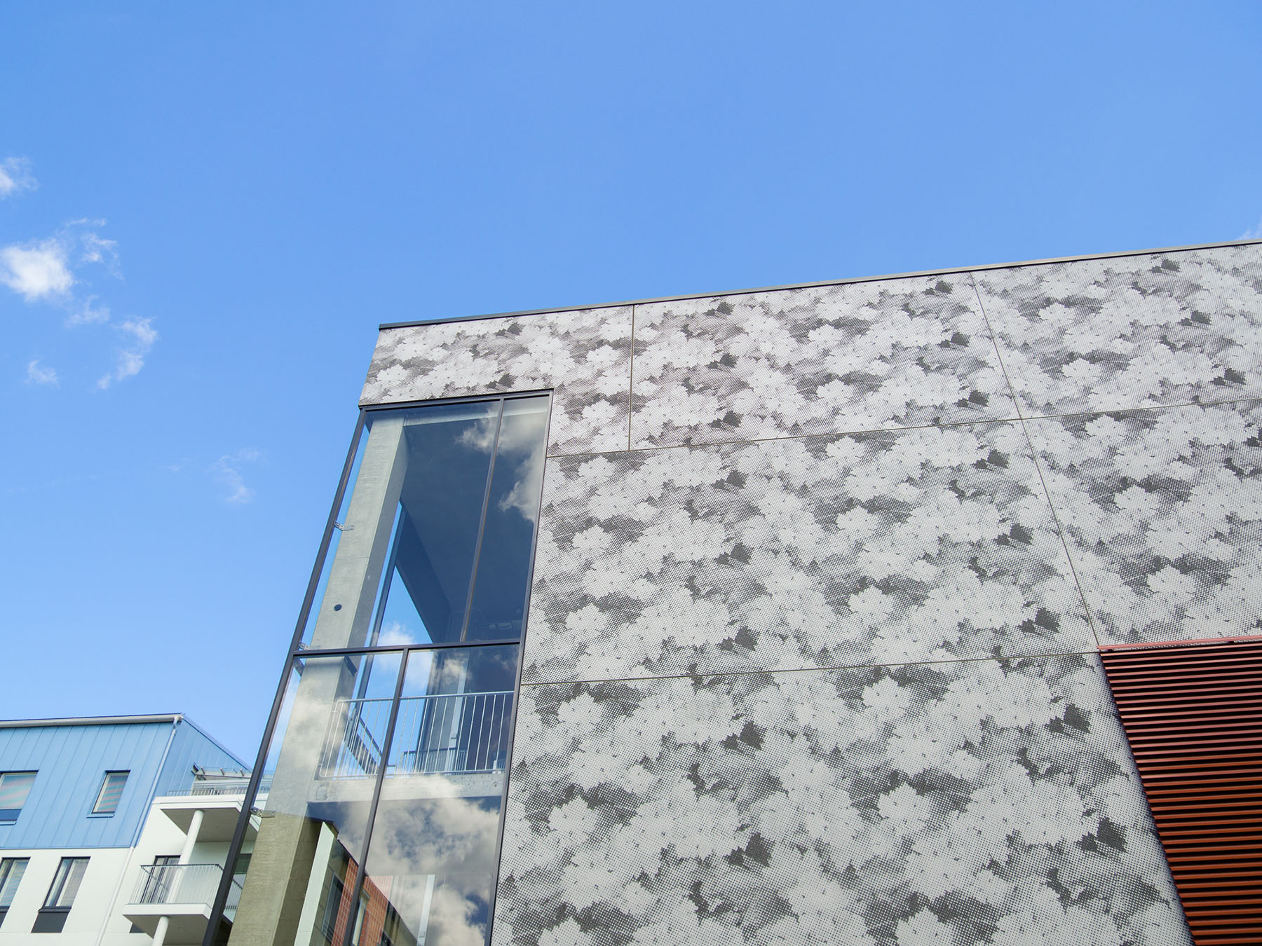
Between these two extremes are many possible color and shading contrasts.
To top it off, the panel joint filler can have different colors, too. Depending on the color you choose, you can have the joint looking like part of the pattern or working with the pattern.
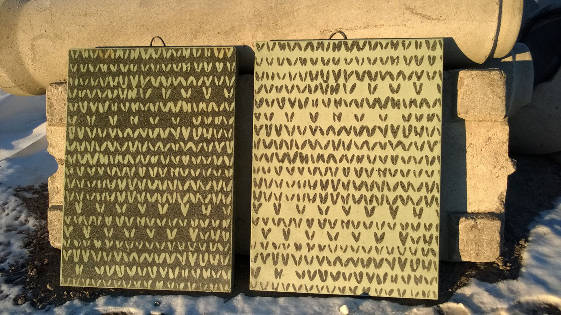
After you have chosen the colors that express the aesthetic you want, you can still fine-tune the overall tone. Lighter or darker impression is controlled by the amount of exposed aggregate surface vs. the amount of smooth cement surface. Here below you see our GCCollection Knit Nega and Knit patterns on test slabs.
Sound easy?
Well it is, as long as you remember the #1 point … Keep it simple.
Want to see my favorite mix?
- a single-color aggregate (here, you can choose any!)
- white cement
- no pigment
I know, this sounds about as exciting as a vodka & soda. Like it or not, the popularity of this particular “drink” is pretty high, though. Cheers!